From Amazon:
Short Summary:
Introduction
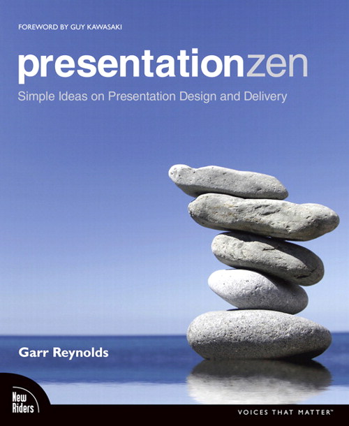
- The key principles of Presentation Zen are: Restraint in presentation. Simplicity in design. Naturalness in delivery.
- Do not use many bullet points and a lot of text
- Use high quality images
Preparation
- Preparing, designing, and delivering a presentation is a creative act, and you are a creative being. Creativity requires an open mind and a willingness to be wrong
- Prepare away from the computer. Go ANALOG
- Pen & Paper (large notebook)
- Slow down – Busyness kills creativity
It’s only in still water that we can see
–Taoist proverb
- Consider handouts, write notes (but learn by heart.. never read from screen/paper) & NEVER give away your presentation. The presentation should be worthless without YOU.
- Create a story to make your message stick
- Focus on the CORE message
Design
- The Japanese Zen arts teach us that it is possible to express great beauty and convey powerful messages through simplification.
- Simplicity is powerful and leads to greater clarity, but not simple nor easy to achieve
- Good design have plenty of empty space. Think substract.. not add..
- pictures are remembered better than words—especially when people are casually exposed to the information and the exposure is for a very limited time.
Delivery
- a presentation requires your full attention, be mindful
- Start STRONG (no warm-up slides)
- Bring energy & passion to your delivery
- Be positive, upbeat, humorous…
- Smile
………
Extensive Summary & quotations:
Introduction
Simplicity is the ultimate sophistication
– Leonardo da Vinci
Presenting in Today’s World
- Presentations today
According to John Sweller, who developed the cognitive load theory in the 1980s, it is more difficult to process information if it is coming at us both verbally and in written form at the same time. Since people cannot read and listen well at the same time, displays filled with lots of text must be avoided.
==========
- Still a long way to go
Technologies such as PowerPoint and Keynote—and new tools such as Prezi—are only useful to the degree that they make things clearer and more memorable, and strengthen the human-to-human connection that is the basis of communication.
==========
- Presentation Generation
“There’s a lot more being transferred than just words. It is in that nonverbal portion that there’s some serious magic. Somewhere hidden in the physical gestures, the vocal cadence, the facial expressions, the eye contact, the passion…. There are hundreds of subconscious clues that go to how well you will understand and whether you are inspired.”
— Chris Anderson (TED Global, Oxford 2010)
==========
- Raising the bar and making a difference
If you want to change things—including the arc of your own career—then how you present yourself and your ideas matters a great deal. Why not be different?
==========
Particular valuable in A Whole New Mind are the “six Senses” or the six “right-brain directed aptitudes,” which Pink says are necessary for successful professionals to possess in the more interdependent world we live in, a world of increased automation and outsourcing
Design starts at the beginning, not at the end – it’s not an afterthoughtWe are wired to tell and receive stories. We are all born storytellers (and “storylisteners”)Symphony is about applying our whole mind—logic, analysis, synthesis, intuition—to make sense of our world (that is, our topic), find the big picture, and determine what is important and what is not before the day of a talk. It’s also about deciding what matters and letting go of the rest.
Empathy allows a presenter, even without thinking about it, to notice when the audience is “getting it” and when they are not.
In the Conceptual Age, says Pink, work is not just about seriousness, but about play as well.
Laughing people are more creative people. They are more productive people.”
Making a presentation is an opportunity to make a small difference in the world, whether it’s in your community, company, or school.
If you believe in your idea, sell it. Make your point as hard as you can and get what you came for.
–Seth GodinFirst, make slides that reinforce your words, not repeat them. Create slides that demonstrate, with emotional proof, that what you’re saying is true, not just accurate. No more than six words on a slide. EVER. There is no presentation so complex that this rule needs to be broken.
–Seth GodinDon’t use cheesy images. Use professional stock photo images.
–Seth Godin
Introduction – In Sum:
The key principles of Presentation Zen are: Restraint in presentation. Simplicity in design. Naturalness in delivery.
The dull, text-filled slide approach is common and normal, but it is not effective
In the Conceptual Age, solid presentation skills are more important than ever before. Presenting well is a “whole-mind” skill. Good presenters target people’s left brain and right brain sensibilities.
Live talks enhanced by multimedia are about storytelling
Preparation
Creativity, Limitations, and Constraints
- You Are Creative
So why look or talk like everyone else? Why strive to meet expectations? Why not surpass expectations and surprise people?
==========If you’re not prepared to be wrong, you’ll never come up with anything original
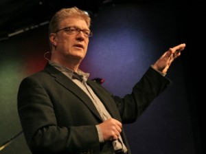
— Sir Ken Robinson
- The Art of Working with Restrictions
When forced to work within a strict framework the imagination is taxed to it’s utmost – and will produce its richest ideas. Give total freedom the work is likely to sprawl.
–T.S. Eliot
- In Sum:
Preparing, designing, and delivering a presentation is a creative act, and you are a creative beingCreativity requires an open mind and a willingness to be wrong
Restrictions and limitations are not the enemy; they are a great ally
As you prepare a presentation, exercise restraints and always keep these three words in mind: simplicity, clarity, brevity
Planning Analog
One of the most important things you can do in the initial stage of preparing for your presentation is to get away from your computer.
==========One way to ensure that your computer and your software applications remain great tools of amplification for your ideas and your presentation is to first turn off the computer and walk away from it. You’ll be back soon enough.
==========
- Paper, a Whiteboard, Post-it Notes, or a Stick in the Sans
My favorite tools for preparing a presentation (or any other project for that matter) usually consist of a large pad of yellow legal paper and colored pens, a moleskin storyboard book, or if I am in my office, a large whiteboard.
==========
- Pen & Paper
And although I have a MacBook Air or iPad with me at virtually all times, it is pen and paper that I use to privately brainstorm, explore ideas, make lists, and generally sketch out my ideas.
I could use the computer, but I find—as many do—that the act of holding a pen in my hand to sketch out ideas seems to have a greater, more natural connection to my right brain and allows for a more spontaneous flow and rhythm for visualizing and recording ideas.
==========
- Whiteboards
I often use a large whiteboard in my office to sketch out my ideas.
==========
- Slowing down to See
Busyness kills creativity.
==========For many of us, this special insight and knowledge, as well as plain ol’ gut feeling and intuition, can only come about when slowing down, stopping, and seeing all sides of our particular issue.
==========They often fail to bring anything unique, creative, or new to the presentation. This is not because they are not smart or creative beings, but because they did not have the time alone to slow down and contemplate the problem. Seeing the big picture and finding your core message may take some time alone
==========It’s only in still water that we can see
–Taoist proverbWhat is my CORE point ?
Or put it this way: If the audience will remember only one thing (and you’ll be lucky if they do), what do you want it to be?
==========What is my point? And why does it matter ?
Put yourself in the shoes of the audience, and ask “So What” ?
- Handouts Can Set You Free
If you create a proper handout for your presentation during the preparation phase, then you will not feel compelled to say everything about your topic in your talk.
==========Instead, prepare a detailed handout, and keep the slides simple. And never distribute a printed version of your slides as a handout. Why?
==========“Never, ever hand out copies of your slides, and certainly not before your presentation. That is the kiss of death.
By definition, since slides are speaker support material, they are there in support of the speaker… YOU. As such, they should be completely incapable of standing by themselves, and are thus useless to give to your audience — David Rose
- Three Parts of a presentation
If you remember that there are three components to your presention—the visuals, your notes, and the handout—then you will not feel the need to place so much information in your slides or other multimedia. Instead, you can place that information in your notes (for the purpose of rehearsing or as a backup) or in the handout.
==========Slides are slides. Documents are documents. They aren’t the same thing.
==========Presentation software tools are not good, however, for making written documents. That’s what word processors are for.
==========To be different and effective, use a well-written, detailed document for your handout and well-designed, simple, intelligent graphics for your visuals. And while it may require more effort on your part, the quality of your visuals and takeaway documents will be dramatically improved.
==========
- In Sum
- Slow down your busy mind & find time alone to see the big picture
- Go analog when planning
- Pen & Paper, Whiteboard
- Key question – What is your core point ? Why does it matter ?
- If your audience remembers only one thing, what should it be ?
- Preparing handouts may help you create better & less crowded slides
Crafting the Story
One of the components for creating sticking messages is story.
==========
- What makes Messages Stick?
“sticky” ideas have six key principles in common: simplicity, unexpectedness, concreteness, credibility, emotions, and stories. And yes, these six compress nicely into the acronym SUCCESs.
==========
- Story & Storytelling
Good stories have interesting, clear beginnings; provocative, engaging content in the middle; and a clear conclusion.
==========
- Look for the conflict
“But as a storyteller, you want to position the problems in the foreground and then show how you’ve overcome them,”
==========
- Contrasts are compelling
Whether we are talking about graphic design or the components of a story, the principle of contrast is one of the most fundamental and important elements to include.
==========In your own presentations, look for contrasts such as before/after, past/future, now/then, problem/solution, strife/peace, growth/decline, pessimism/optimism,
==========
- Using storytelling principles in presentations
Basic elements to include in your story:
1. Identify the problem. (This could be a problem, for example, that your product solves.)
2. Identify causes of the problem. (Give actual examples of the conflict surrounding the problem.)
3. Show how and why you solved the problem. (This is where you provide resolution to the conflict.)
==========Take people on a journey that introduces conflict and then resolves that conflict. If you can do this, you will be miles ahead of most presenters who simply recall talking points and broadcast lists of information. Audiences tend to forget lists and bullet points, but stories come naturally to us;
==========
- Stories and Authenticity
We do not tell a story from memory alone; we do not need to memorize a story that has meaning to us. If it is real, then it is in us. Based on our research, knowledge, and experience, we can tell it from our gut. Internalize your story, but do not memorize it line by line. You can’t fake it. You believe in your story, or you do not.
==========
- It’s Not Just About Information
Picasso once said, “Computers are useless for they can only give answers.” Computers and Google can indeed give us routine information and facts we need. What we want from people who stand before us and give a talk is that which data and information alone cannot: meaning.
==========
- The Process
Step1 – Brainstorming. Step back, go analog, get away from the computer, tap into the right brain, and brainstorm ideas.
==========As the great Linus Pauling once said, “The best way to have a good idea is to have a lot of ideas.”
==========Step2 –
Grouping and identifying the core. In this step, I look to identify one key idea that is central (and memorable) from the point of view of the audience. What is the “it” that I want them to get?
==========Step3 – Storyboarding off the computer
Step4 – Sketch your visuals
Step5 –
Storyboarding on the computer. If you have a clear sense of your structure, you can skip steps 3 and 4 and start building the flow of your presentation directly in slideware
==========
- Nancy Duarte:
Because presentation software was never intended to be a brainstorming or drawing tool.
The applications are simply containers for ideas and assets, not the means to generate them. Too many of us have fallen into the trap of launching our presentation application to prepare our content.Often ideas come immediately. That’s good, but avoid the potential pitfall of going with the first thing that comes to mind. Continue to sketch and force yourself to think through several more ideas. It takes discipline and tenacity—especially when it feels like you solved it on the first try.
- Editing & Restraint
Presenters often include superfluous items because they are proud of their work and want to show it off even when it does not help support the speaker’s particular point.
==========after you have prepared your presentation, go back and edit like crazy, eliminating parts that are not absolutely crucial to your overall point or purpose. You must be ruthless. When in doubt, cut it out.
==========
- In Sum
- Make your ideas sticky by: Keeping things simple, examples, stories, unexpected & emotions
- Brainstorm topics away from computer
- make a storyboard on paper.. then on computer
- RESTRAINT – focus on core message
Design
Simplicity: Why it Matters
Our lives are frittered away by detail; simplify, simplify.
— Henry David ThoreauSimplicity—along with other precepts such as restraint and naturalness—are key ideas found in Zen and the Zen arts:
==========
Steve Jobs was one of the best presenters the world of business has ever seen
Jobs was a student of Zen and was influenced early on by the Japanese aesthetic. “I have always found Buddhism, especially Japanese Zen Buddhism in particular, to be aesthetically sublime,” Jobs told biographer Walter Isaacson,
==========
- Kanso (simplicity)
A key tenet of the Zen aesthetic is kanso or simplicity. In the kanso concept, beauty and visual elegance are achieved by elimination and omission.
==========
- Shizen (Naturalness)
The aesthetic concept of naturalness or shizen “prohibits the use of elaborate designs and over refinement,”
==========
- Shibumi (Elegance)
shibumi represents elegant simplicity and articulate brevity, an understated elegance.
==========
- Zen aesthic values:
- Simplicity
- Subtlety
- Elegance
- Suggestive rather than descriptive or obvious
- Naturalness
- Empty space (or negative space)
- Stillness, tranquility
- Eliminating the nonessentials
- Wabi-Sabi Simplicity
The ideals of wabi-sabi are most applicable to disciplines such as architecture, interior design, and the fine arts. But we can apply the principles to the art of digital storytelling (presentations with AV support or integration) as well. Wabi-sabi embraces the “less is more” idea that is often talked about—and often ignored—in today’s society.
==========A Zen garden is also a lesson in simplicity: open space without ornamentation, a few rocks carefully selected and placed, raked gravel. Beautiful. Simple. The Zen garden is very different from many gardens in the West that are absolutely filled with beauty, so much beauty, in fact, that we miss much of it.
==========
By stripping down an image to essential meaning, an artist can amplify that meaning…
— Scott McCloud
- Amplification Through Simplification
The Japanese Zen arts teach us that it is possible to express great beauty and convey powerful messages through simplification.
==========The situation today is that most people have not been exposed to the idea of making a visual stronger by stripping it down to its essence.
==========All that’s needed… is the desire to be heard. The will to learn. And the ability to see.
— Scott McCloud
Often, the approach I advocate may use more time, not less time, for you to prepare, but the time you are saving for your audience can be huge.
==========When I save time for myself, I am pleased. But when I save time for my audience—by not wasting their time and instead by sharing something important with them—I feel inspired, energized, and rewarded.
==========
- In Sum
- Simplicity is powerful and leads to greater clarity, but not simple nor easy to achieve
- reduction of the nonessentials
- Good design have plenty of empty space. Think substract.. not add..
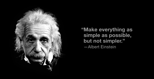
- Simple, but not too simple
Presentation design: Principles and Techniques
Graphic design is as much art as science.
==========
- Presentation design
For me, design does not wait until the end. Rather, it comes at the beginning, right from the start.
==========Design is not art, although there is art in it. Artists can, more or less, follow their creative impulses and create whatever it is they want to express. But designers work in a business environment. At all times, designers need to be aware of the end user and how best to solve (or prevent) a problem from the user’s point of view. Art is good or bad in and of itself. Good art may move people; it may change their lives in some way. If so, wonderful. But good design must necessarily have an impact on people’s lives, no matter how seemingly small. Good design changes things.
==========
- Signal-to-noise Ratio
The goal is to have the highest signal-to-noise ratio possible in your slides.
==========author John Daido Loori says that the Zen aesthetic “reflects a simplicity that allows our attention to be drawn to that which is essential, stripping away the extra.”
==========
- Who Says Your Logo Should Be on Every Slide?
“Branding” is one of the most overused and misunderstood terms in use today.
==========If you are presenting for an organization, try removing its logo from all but the first and last slide.
==========
- How many bullet points per slide?
But bullet points are usually not effective in a live talk.
==========A good general guideline is to use bullet points very rarely and only after careful consideration of other options for displaying the information in a way that best supports your message.
==========
- Picture Superiority Effect
pictures are remembered better than words—especially when people are casually exposed to the information and the exposure is for a very limited time.
==========
- Quote This
displaying quotations in slides can be a very powerful technique. Depending on the presentation, I often use quite a few quotes from various fields to support my points. The trick is not to use them too much and to make sure they are short and legible.
==========But rather than using a small photo or other element,consider placing the text within a larger photo.
- Empty Space
Empty space implies elegance and clarity.
==========Many Japanese homes have a washitsu, a traditional room with tatami mats, that is simple and mostly empty. The empty space allows for the appreciation of a single item, such as a single flower
==========
- The power of faces to get attention and Guide Viewers’ Eyes
We are amazingly good at seeing faces.
==========If you use images of people, make sure they do not unintentionally guide viewers away from what you want them to see.
==========
- Balance
The viewer should never have to “think” about where to look. A visual must never confuse anyone.
==========
- Grids & the Rule of Thirds
The rule of thirds is a basic technique that photographers learn for framing their shots.
==========Remember, there is no liberty in absolute freedom when it comes to design. You need to limit your choices so that you do not waste time adjusting every single design element to a new position.
==========virtually every Web page and every page in a book or magazine is built atop a grid. Grids can save you time and ensure that your design elements fit more harmoniously on the display.
==========
- The Big Four: Contrast, Repetition, Alignment, Proximity
The whole point of the alignment principle is that nothing in your slide design should look like random placement.
==========The audience may not be conscious of it, but slides that contain elements in alignment look cleaner.
==========The more strikingly visual your presentation is, the more people will remember it. And more importantly, they will remember you.
—Paul Arden
- In Sum
- Design Matters
- Keep the principle of Signal-to-Noise ratio in mind & Avoid 3D effects
- People remember visuals better than bullet points
- Empty space is NOT nothing; it is a powerful something
- use high-quality photos, consider full-bleed images and place elements on top
- use the principle of contrast to create strong dynamic differences. If it’s different… make it very different
- use the principle of repetition to repeat selected elements throughout your slides
- use the principle of alignment to visually connect elements on a slide. using a grid gives your slide a clean, well-organized look
- Use the principle of proximity to ensure that related items are grouped together
Sample Visuals: Images & Text
Many good samples.. my fav:
Delivery
The Art of Being Completely Present
One of the most fundamental things you can learn from the world of Zen is the art of mindfulness.
==========That is, Zen makes no distinction between ordinary life and spiritual life. Meditation is not an escape from reality at all; in fact, even everyday routines can be methods for meditation.
==========So, rather than hating washing the dishes, you just wash the dishes. When you write a letter, you write a letter. And when you give a presentation, you give a presentation.
==========True mindfulness is accessible to all, although it is not easy to obtain.
==========Worries are the worst things of all because they are always about the past or about the future—two things that do not even exist in the present.
==========
- The Mind That is No Mind
When you perform in a state of “no mind,” you are free from the burdens of inhibitions and doubt and can contribute fully and fluidly in the moment. Artists know this state of mind, as do musicians and highly trained athletes.
==========
- Contribution and being in the moment
Every presentation is a performance, and Ben Zander knows a thing or two about the art of performance.
==========There are a lot of good presenters, Dan (Pink) said, but Ben Zander is in another league.
Please check out Ben Zanders fantastic presentation @ ted.com:
- Passion, Risk, and “Playing on one Buttock”
Zander suggests that instead of getting so dejected by mistakes, we instead exclaim loudly, raise our arms, and shout “How fascinating!” every time we make a mistake. Think about that. Another mistake? How fascinating! Another opportunity to learn something just presented itself. Another unlucky break? No worries! Move forward. You cannot worry about mistakes and be fully present in the moment at the same time.
==========
- Don’t take yourself so seriously
Humor is a wonderful way to remind everyone around us—no matter how hard the work gets—that our true and most “central” self is not obsessed with childish demands, entitlements, and calculations but is instead supportive, confident, helpful, and even inspiring. A presentation is as good a time as any to let people see that side of you.
==========
- In Sum
- a presentation requires your full attention
- mistakes may happen, but do not dwell on past mistakes or worry about future ones
- you will make it look easy by preparing and practicing like mad
- although you plan well, you must remain flexible, totally aware, and open to possibilities that arise
Connecting with an Audience
- Jazz, Zen, and the art of Connection
While there are many forms of jazz, if you want to at least get close to the essence of the art, then listen to the 1959 album Kind of Blue by Miles Davis. The liner notes for this classic album were written by the legendary Bill Evans, who plays piano on the recording. In these notes, Bill makes a direct reference to one of the Zen arts, sumi-e.
==========The spirit of jazz is about honest intention.
==========Jazz makes the complex simple through profound expressions of clarity and sincerity. It has structure and rules but also great freedom. Above all, jazz is natural.
==========Knowing what to leave out takes work. Again, anyone can include everything and say everything. It is the master presenters (or writers, artists, and so on) who know what to exclude and have the courage to cut it.
==========
- Start Strong to make a connection
I always urge people not to waste time at the beginning of a presentation with formalities such as long introductions or filler talk that is not related to the presentation’s goal. The beginning is the most important part. You need an opening that grabs people and brings them in. If you fail to hook them at the start, the rest of your presentation may be for naught.
==========
- PUNCH
- Personal
- Unexpected
- Novel
- Challenging
- Humerus
There are many ways to start a presentation, but no matter how you choose to start, do not waste those initial valuable two or three minutes “warming up” the audience with filler material or formalities. Start strong.
==========Do not start with an agenda slide. After you have made an initial connection with the audience, however, it’s a good idea to give people an idea of where you are going during your time.
==========
- Project yourself
There are three things to consider when evaluating your ability to project yourself to an audience aside from the content of the talk: The way you look, the way you move, and the way you sound.
==========
- Connect with eye contact
Related to the importance of facing the audience is establishing good eye contact. Maintaining natural eye contact with the audience is crucial,
==========For larger audiences in a typical keynote-style presentation, it is still useful to pick out actual people to lock eyes with as you speak—even people who are sitting toward the back. By looking at one person, others near that person will feel as if you are looking at them as well. This is a technique that professional singers use when playing larger halls.
==========
- Put Energy in your voice
Your tone should be conversational, but your energy must be cranked up several notches. If you are enthusiastic, the energy will help project your voice. Mumbling is absolutely not permitted, and neither is shouting.
==========So stand tall, speak up, and articulate clearly,
==========The microphone, far from being a barrier to connection, can actually be a great enabler of intimacy as it allows you to project in your best and most engaging natural voice.
==========
- Don’t read a speech
“Reading is boring,” he says. “Worse, reading a speech makes the speaker look inauthentic and unenthusiastic.” This goes for reading slides as well.
==========TED truly exemplifies the spirit of the conceptual age—share, give it away, make it easy—because the more people who know your idea, the more powerful it becomes.
==========
- Hara Hachi Bu – Why Length Matters
Many studies show that concentration really takes a hit after 15 to 20 minutes. My experience tells me it’s less than that. For example, CEOs have notoriously short attention spans while listening to a presentation. So the length of your presentation matters.
==========
- One Secret to a Healthy Life (and a Great Presentation)
The Japanese have a great expression concerning healthy eating habits: hara hachi bu, which means “eat until 80 percent full.”
==========
I have found—ironically, perhaps—that if I stop eating before getting full, I am more satisfied with the meal. I’m not sleepy after lunch or dinner, and I generally feel much better.
==========My advice is this: No matter how much time you are given, never ever go over your allotted time; in fact, finish a bit before your time is up. …. try to shoot for 90 to 95 percent of your allotted time.
==========
- In Sum:
- try to appeal to both the logical & emotional sides of your audience
- Bring energy & passion to your delivery
- Don’t hold back… if you have a passion for a subject, then let people know it
- Make a strong start with PUNCH
- Project yourself well by dressing the part, moving with confidence & purpose, maintaining good eye contact, and speaking in a conversational style but with elevated energy
- Try not to read a presentation or rely on notes
- Remember the concept of hara hachi bu
The Need for Engagement
We say that the best presenters and public speakers are the ones who engage their audiences the most.
==========For me, regardless of the topic, engagement is, at its core, about emotion. … The best presenters engage by tapping people’s emotions.
==========Logic is necessary, but rarely sufficient. We must appeal to people’s right brains, or creative sides, as well.
==========
- Mirror Neurons
Watching something and doing something are not the same, of course, but as far as our brains are concerned, they’re pretty darn close.
==========An animated, natural display of emotions enriches our narrative as it stimulates others to unconsciously feel what we feel.
==========Our data and our evidence matter, but the genuine emotions we project have a direct and strong influence
==========
- Power of the Smile
Smiles are contagious, yet they must be real.
==========While you may think it’s only your words that people should remember, your audience will actually recall much of what they saw, including your facial expressions, and what they felt.
==========
- Stimulate Their Curiosity
we are all born insanely curious creatures—that’s how we learn.
==========the best teachers are the ones who demonstrate their curiosity and passionate interest in their subjects.
==========
- Engagement is not about tools
In his 2011 TEDxTokyo presentation, Shimizu underscored the idea that it is not always more that makes us happy, but rather it is the intentional selection of less, an aesthetic at the heart of traditional Japanese culture.
==========
- Gihan Perera
Webinar expert Gihan Perera offers advice on how to run an effective webinar that engages people.
==========Take the pressure off yourself by starting small. Start with small groups, not large audiences. Offer free webinars before you start charging money. Get somebody else to manage the technology for you. Write a script for what you’re going to say. But whatever you do: Start!
==========
- Steve Jobs learning points..
People will make an assessment about your performance in the first two minutes, so you have to start strong. But you have to finish even stronger.
==========
- Get Close To The Audience
but as much as possible, engaging an audience means being close to the audience. In addition, it helps if your audience members are close to each other.
==========
- Use a Small Remote to Advance Visuals
Remote control devices for computers are relatively cheap and an absolute must.
==========
- Use the B key
If you use slideware in presentations, one of the most useful keys to remember is the B key. If you hit the B key in PowerPoint or Keynote, your screen becomes black.
==========
- Leave The Lights On
If you are going to engage an audience, they have to be able to see you. When the audience can actually see your eye movements and read your facial expressions, they will better understand your message.
==========
- How do you know when you are Engaging?
Ben Zanders – Look in their eyes… if their eyes are shining, you know you’re doing it
- In Sum:
- Engagement involves tapping into the audience emotions
- Keep the lights on.. people must be able to see you
- Remove barriers.. avoid podiums & lecterns
- use wireless mic.. and remote control to advance slides
- Be positive, upbeat, humorous…
Next Step
What We think, we become
—Buddha
- The Journey begins
Learning to become a great presenter is a journey
Reading and studying is good, doing it is best
Playing the blues & jazz is about feelings… it’s similar to making a presentation, it’s not about technique
just walking down the street you’ll find that the examples which to learn from are all around you. The lessons are everywhere. It’s just a matter of seeing
The essential keys to improvement are simply having an open mind, an open heart, and a willingness to learn, even if we make mistakes in the process
Aim to design & deliver your presentation while allowing the principles of restraints, simplicity, and naturalness to always beyour gentle guide
A journey of a thousand miles begins with a single step
— Lao-tzu
